

What better time to write my blog post than at 11 o'clock at night? I have wanted to write a Mundane Monday post for a few weeks now, but time and energy have not been working together to create a stable writing environment. Mondays are not fun, but writing is like a "spoonful of sugar"; it can help the "I can't face another week. Please don't let the weekend truly be over," woes seem less IN YOUR FACE. Well, at the very least, less like Monday has won this triumphant battle. Ha ha take that Monday!
New things with me:
- I work evenings a few days each week now. I work evenings a few days each week now. This, so far, has meant an excuse to be super lazy in the morning. I'm not just being hard on myself, but honest too. This also explains why Mundane Mondays are not being written. I can't rush genius and if my mornings are for laziness . . . well you see my dilemma. (insert smile)
- I had my first photo session for good friends of mine on Saturday. I will not be posting any of the more serious and well thought out pictures. By well thought out I mean, when the camera was on the tripod and I was snapping away with direction. I was super nervous (circumstance and caffeine, not good combination) so my attempts with the candid shots didn't go as well as planned. However, keep an eye out on my Flickr for the few that I liked enough to post. Quality is still not great, but my nerves were extremely sketchy. I need to get over my fear of disrupting people or getting scared they will stare at me and just go for it . . . snap away! I believe photographers have this license, as artists, to point and click at "weird" things and no one will think anything of it; I could be wrong.
- I finished a project! This is the main reason for this post. I have been working to finish a project (this project) since the beginning of January for the expressed purpose of blogging about it AND helping to accomplish a New Year's Goal. I like goal completions!
I save money by way of the money envelope system. At times this works well for me, especially if I am very determined for the item or items to be in my hands . . . yesterday. Other times it is difficult, in that you have a ready source of cash waiting in your room and it has this creepy enticing voice, "Maddie, Maddie, you know you want to take me out and spend me!" How a voice can be creepy and enticing at the same time, I will never know, but there it is folks. On the other hand sometimes your car decides it is ready for a doctor's visit. Captain, my car, visits the doctor more than I do and that is saying something. I know, I know . . . I should have another envelope for Captain. I'm working on it.
My money envelope system just got a makeover! Thank you Pinterest!
Thanks to these blogs:
Saltwater Kids - for the design/look of the pouches
Twelve22 - for the zipper tutorial
While this project was fun; I learned I hate, HATE, sewing with zippers. It was a great opportunity to indulge in hand sewing for the embroidery. I have long liked hand sewing for its preciseness and relaxing "old-fashioness".
Here are mine finished:

I picked fonts online that I felt represented each thing I'm saving up for. I used a light box and pencil to trace the letters onto the cream fabric. Pick your embroidery floss colors and coordinating fabrics (or themed fabrics) and have at it! I purchased zippers that were bright and vibrant colors (7 inch zippers work great) to help make this even more fun. Saving money . . . fun? (insert smile)

Tats & Holes was the first "envelope" I finished. My idea was to pick a font that represented tattoos and then use the rivets for the word 'holes'. However, the cream fabric for this envelope was more like burlap and didn't work so well with the embroidery or the rivets. I opted for my own handwriting and only using the rivets on two letters.
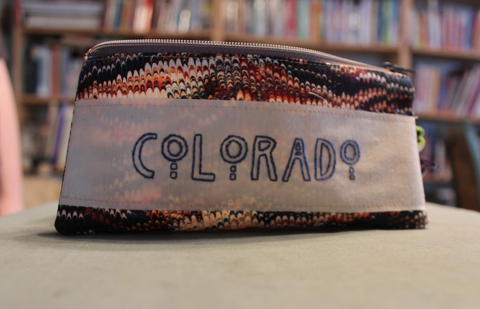
I think Colorado is my favorite. I used the font Willow and light royal blue embroidery floss.

Portland is for Deven. Deven reminds of pirates for some reason and well Goonies was in Oregon, so there you go! The font for this one was a bit tricky in the setup, hence the capital 'T' and 'L'. I used Sketchley Swash BT.

Longboard's fabric is less longboard and more "this is a short term savings venture, so let's make this 'envelope' a bit more interchangeable." I appropriately used the font Original Surfer. (insert grin) Landyachtz here we come!

Home is home . . . saving up for a place to be my very own. I used the font PWScratched.
There you have it. It is late. I'm sorry if this post felt rushed and was posted so late, but enjoy! I'm off to read some before bed.

 |
| "Vibrant Silence" |
No comments:
Post a Comment